Visualize real-time data streams with Gnuplot
Some times when I need to troubleshoot a problem, adding some visualization to the process can help a lot, especially if one need to correlate between 2 (or more) metrics in the data. But you don’t want to mess a round with some monitoring tools, or RRD files. So here is a simple solution I found to collect some stats from a remote server and plot them in real-time by piping them info gnuplot.
At first I cam a cross a small script by Thanassis Tsiodras on his post I though that exacly what is was looking for, but in the end of his post he mentioning feedgnuplot created by Dima Kogan which solve the same problem in a different way — which I find more suitable for my case.
I had small script which dump the samples in the following format
2016-01-07 21:56:35 3266.32812500000 6519.48828125000
So I run my script in a while loop and write the stats into a local file,
ssh remoteserver -- su - dba -c fetch_data1 > /tmp/local
And then I use tail -f and pipe the output to the following feedgnuplot command,
$ tail -n100 -f /tmp/local | \
./feedgnuplot \
              --timefmt "%Y-%m-%d %H:%M:%S" \
              --set 'format x "%H:%M"' \
              --domain --lines \
              --legend 1 "tempdbs" \
              --legend 0 "rootdbs" \
              --y2 1 --stream 5
Which will open a graphs windows, and you can see your data getting plotted over time,
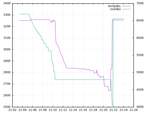
Visualize with gnuplot